
AROVA DESIGN · STYLE INTELLIGENCE SERIES
Interior Design Styles Explained: A Complete Guide
Every major style - from Japandi to dark academia to coastal - defined precisely, with the characteristics, mistakes, and budgets that matter.
Updated July 2026 · 16-minute read · By Arova Design Editorial
Interior design style is not a cage - it is a vocabulary. When you know the vocabulary of a style, you can speak it fluently, adapt it intelligently, and break its rules with intention rather than ignorance. This guide defines the 10 major design styles of 2026 with the precision they deserve: not as mood boards, but as systems of rules, materials, proportions, and palettes that produce recognizable results.
For guidance on applying any of these styles room by room, see our Room-by-Room Design Guide. For help choosing between styles and getting specific product recommendations, the AI design tools covered in our full AI guide can walk you through your specific space. Take the style quiz at the bottom of this page if you're genuinely unsure which direction fits you.
Style 01
Japandi
The beauty of necessary things
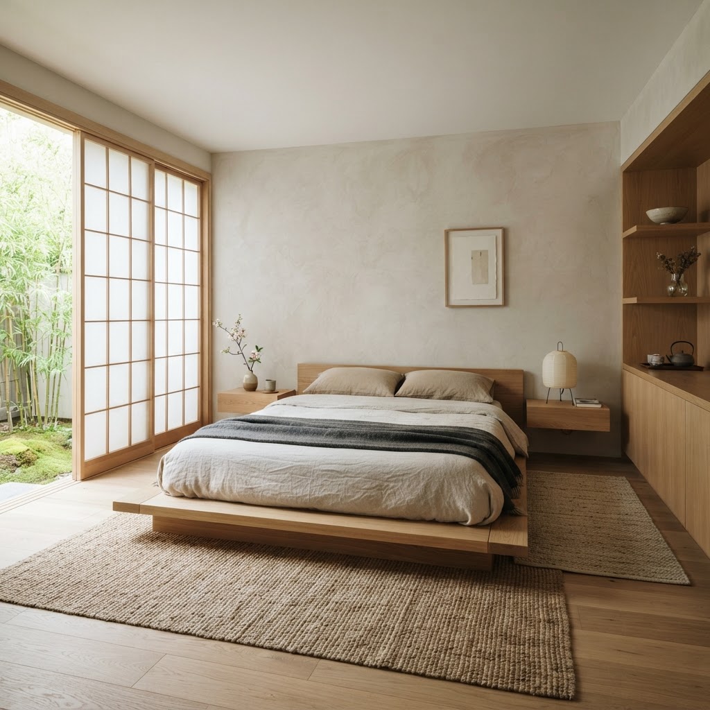
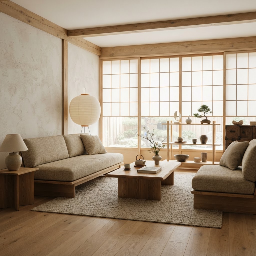
Japandi is the most coherent design movement of the 2020s - a genuine synthesis of Japanese wabi-sabi philosophy and Scandinavian functional minimalism that produces rooms of extraordinary calm. The defining principle: every object in a Japandi room must earn its place through both function and beauty. Objects that do one without the other don't belong.
The materials vocabulary is specific: light ash, white oak, or bamboo for furniture; natural fiber for every textile (linen, cotton, wool, jute - no synthetic fabric visible); ceramic with handmade irregularity for vessels; clay or matte black for hardware. The palette stays in warm neutrals - putty, warm white, undyed linen - with accents of muted sage, terracotta, or deep charcoal, never primary colors.
Who Japandi Is For
Japandi works for people who are overstimulated by visual clutter, who appreciate craft and material quality over novelty, and who are willing to own fewer things of better quality. It requires storage discipline - everything not on display must have a home out of sight. It does not work well for collectors, people with young children in a room that must also function as a playroom, or anyone who finds the absence of color and pattern uncomfortable rather than calming.
The Two Most Common Japandi Mistakes
Mistake 01
Buying "minimalist" objects that are cold, not calm
Chrome, glass, concrete, and cold-white surfaces produce a clinical minimalism, not wabi-sabi warmth. Japandi warmth comes from natural imperfection - grain variation in wood, the slight unevenness of a hand-thrown pot, the texture of undyed linen. If every surface is smooth and synthetic, it is not Japandi.
Mistake 02
Confusing "empty" with "considered"
Japandi rooms are not empty - they are edited. The distinction matters because empty rooms feel neglected; edited rooms feel intentional. The few objects that remain in a Japandi room should be beautiful. One artisan ceramic bowl on a shelf says Japandi. One Amazon filler vase says "I removed everything else."
Starting Budget Framework
Design your Japandi room with Arova. Tell Arova your room dimensions and current furniture - get a specific Japandi edit plan with products at your budget.
Start Japandi Consultation →Japandi is the design hybrid of Japanese wabi-sabi aesthetics and Scandinavian hygge - defined by natural materials, functional minimalism, warm neutral palettes, and craftsmanship without ornamentation. The central principle: every object must earn its place through both function and beauty. The palette is warm putty, muted sage, and charcoal, with furniture in light ash, oak, or bamboo.
Style 02
Mid-Century Modern
Optimism made physical
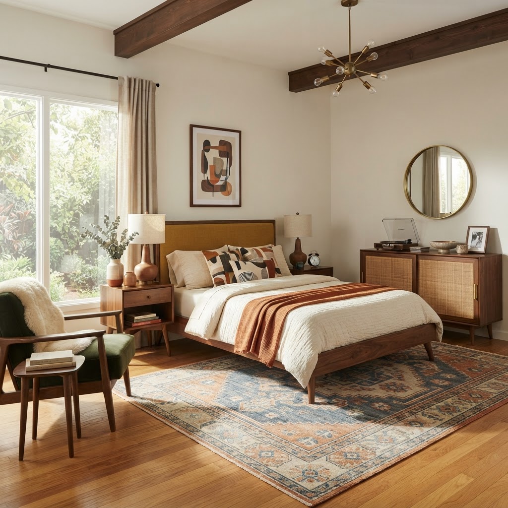
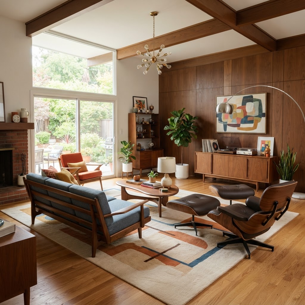
Mid-century modern (MCM) is the design vocabulary of American postwar optimism - the period from roughly 1945 to 1975 that produced Eames chairs, Saarinen tables, walnut credenzas, and the belief that good design could and should be accessible to everyone. It is characterized by organic forms that contradict modernist rigidity (the gentle curves of an Eames shell against the clean lines of a walnut credenza), bold accent colors (mustard, avocado, terracotta, burnt orange), and material honesty: walnut wood shows its grain, upholstery shows its texture.
The functional principle of MCM furniture is structural legibility - you should be able to understand how a piece is made and supported by looking at it. Tapered legs, exposed joinery, and visible material construction are hallmarks. A sofa with visible legs, a coffee table with a hairpin-leg base, and a sideboard on tapered walnut legs are archetypal MCM elements.
Who Mid-Century Modern Is For
MCM works for people who appreciate bold accent color without maximalism, who value design history, and who own or are willing to purchase quality vintage or reproduction furniture. It is one of the most forgiving styles for mixing vintage with contemporary - an authentic 1960s Eames rocker alongside a contemporary walnut media console reads correctly because the design language is shared.
The Two Most Common Mid-Century Mistakes
Mistake 01
Choosing cheap MCM "inspired" furniture
Mid-century modern is more copycat-prone than any other style. Hairpin legs and tapered feet get applied to furniture with none of the proportional logic that makes MCM work. The result is a room that looks like MCM but feels cheap. Better to own one good piece - a real Eames, a genuine Herman Miller, a Craigslist find with proper provenance - and build around it than to fill a room with architectural imposters.
Mistake 02
Overdoing the accent color
MCM accent colors (mustard, avocado, burnt orange) work as accents - throw pillows, a single accent chair, a ceramic lamp base. An entire sofa in mustard velvet with mustard throw pillows and a mustard rug is not MCM - it is a monochrome experiment. The neutral foundation (cream, white, light walnut) must dominate.
Starting Budget Framework
Design your mid-century room with Arova. Describe your space and budget - Arova identifies which MCM pieces are genuinely worth buying vs. which shortcuts work without compromising the look.
Start MCM Consultation →Style 03
Scandinavian
Function elevated to art form
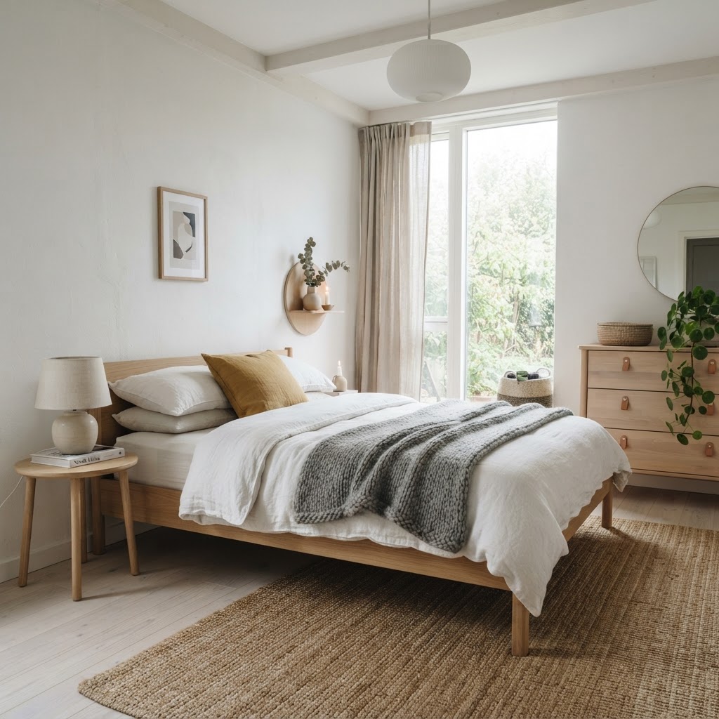
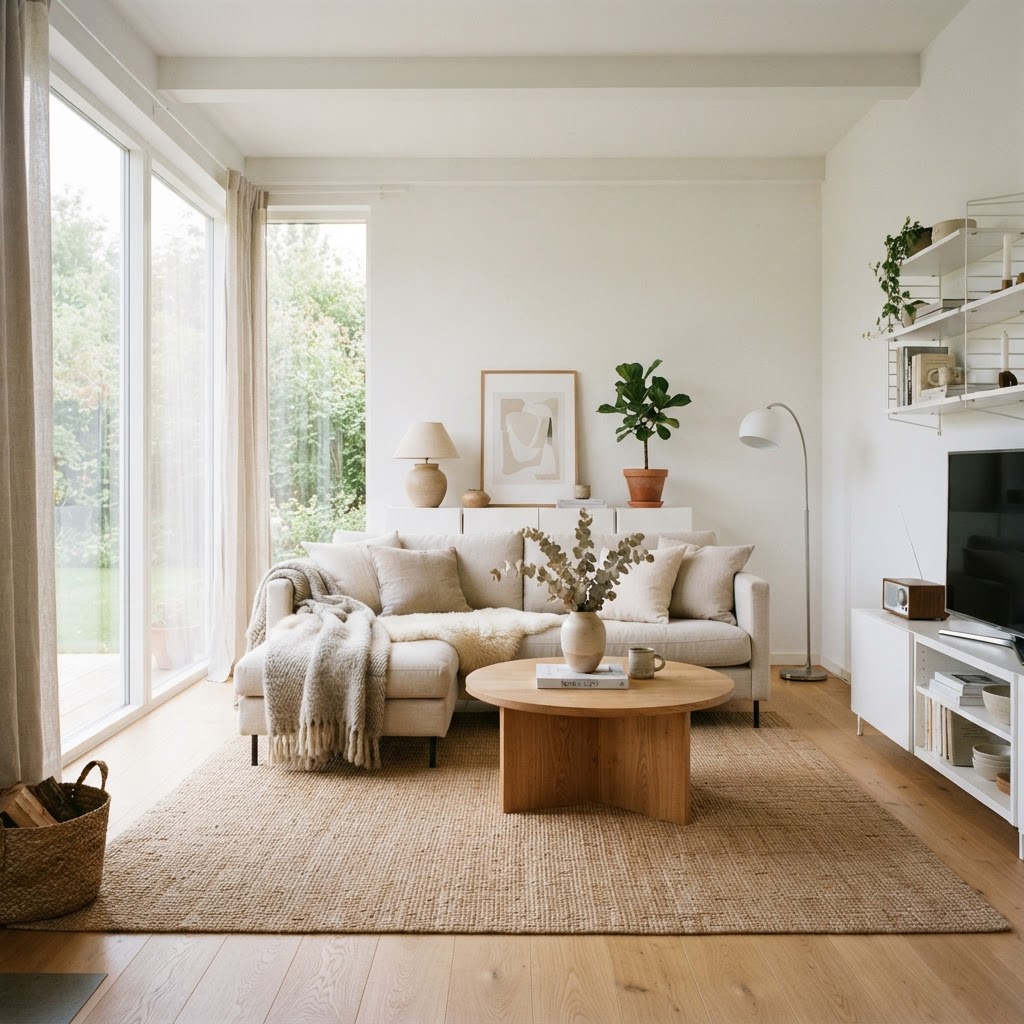
Scandinavian design is the philosophy that good design should be functional, beautiful, and accessible to everyone. It emerged from the Nordic democratic tradition and produced the furniture vocabulary most of the world now treats as "modern." The defining characteristics: white or warm-white walls that maximize limited winter light, light oak or pine furniture with clean lines, natural textiles in undyed or muted tones, and the strategic use of one darker anchor element (a navy sofa, a black-framed window, a forest-green armchair) to prevent the palette from reading as sterile.
Who Scandinavian Design Is For
Scandinavian design works for maximizing perceived light and space in apartments and smaller homes. It is the most forgiving style for mixing furniture from different eras because the clean-line, light-palette vocabulary is so broadly applicable. It is not the right style for people who find all-white spaces anxiety-inducing or who have strong color preferences - for them, Japandi or warm rustic will produce a more personally resonant result.
The Two Most Common Scandinavian Mistakes
Mistake 01
All white with no warmth anchors
Pure white Scandinavian rooms photograph well and feel cold to live in. Authentic Scandinavian design balances the light palette with warmth anchors: a sheepskin throw, a jute rug, warm-temperature bulbs (2700K, never daylight), wood grain on furniture that is neither white-painted nor laminate. Remove warmth from Scandinavian design and you get a hospital.
Mistake 02
IKEA-only execution
IKEA represents the democratic accessibility core of Scandinavian design philosophy - but a room furnished entirely from IKEA lacks the material variation and craft quality that gives Scandinavian rooms their depth. The correct approach: IKEA for storage and structural pieces (KALLAX, PAX), combined with one or two quality pieces (a ceramic lamp, a woven rug, a solid-wood side table) that add material richness the flat-pack pieces can't provide.
Starting Budget Framework
Design your Scandinavian room with Arova. Describe what you're starting with - Arova identifies the specific warmth anchors your space needs to feel hygge rather than hospital.
Start Scandi Consultation →Style 04
Dark Academia
The library you actually want to live in
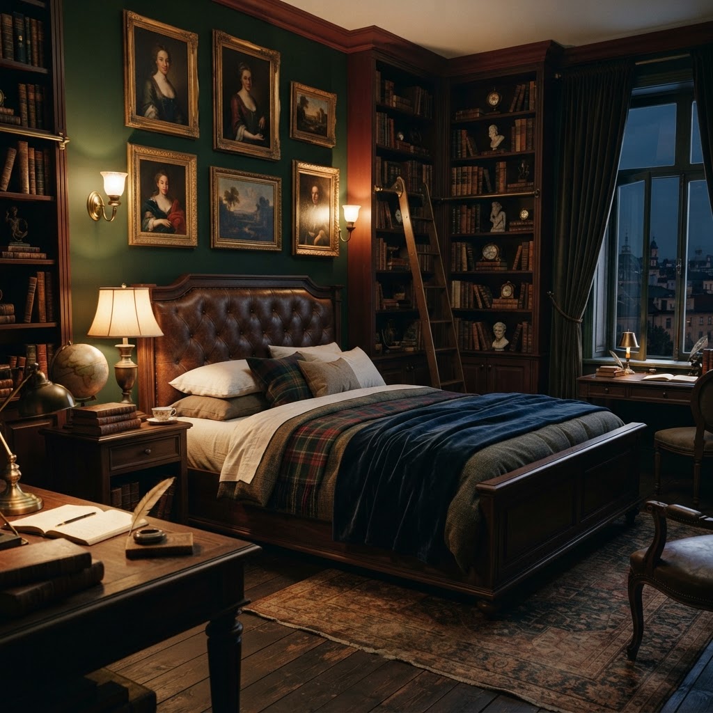
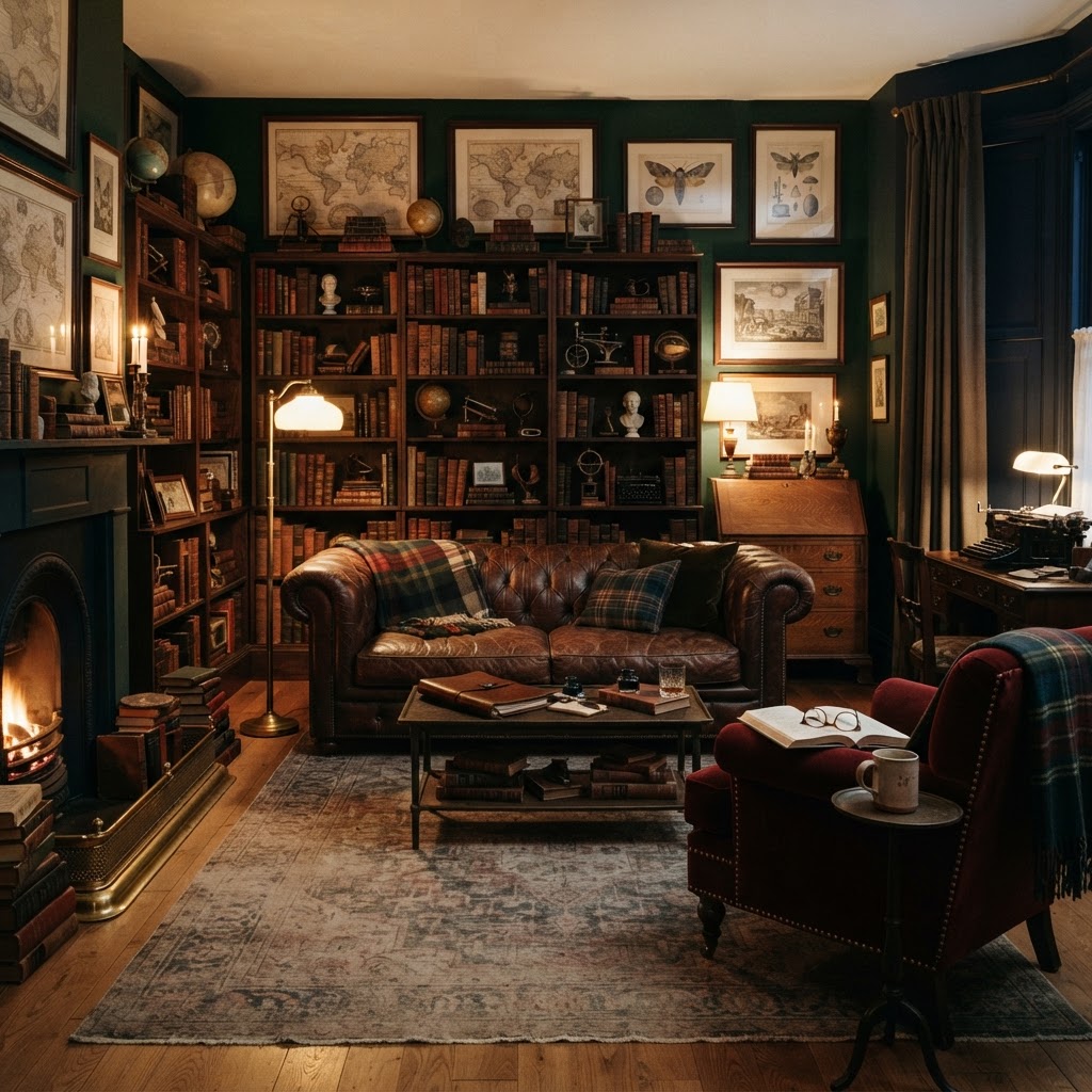
Dark academia is the design aesthetic rooted in the visual vocabulary of old European universities, private libraries, and literary salons - the rooms in which serious intellectual life was once conducted. It is characterized by deep, moody color palettes (forest green, oxblood red, deep navy, warm charcoal), natural materials with age and character (dark walnut, leather, brass, velvet, linen), and an accumulation of books, art, and objects with intellectual or historical resonance.
Dark academia is curated maximalism - not the chaotic maximalism of collected-without-intention, but the dense, purposeful accumulation of objects that each have a story. A dark academia room that succeeds feels like the personal library of someone who has spent decades acquiring things that matter. A dark academia room that fails feels like a moody furniture set with no soul behind it.
Who Dark Academia Is For
Dark academia works for people who love books and have them, who are drawn to historical and natural objects, and who find color and pattern comforting rather than overwhelming. It is emphatically not minimalist - it requires density of objects to read correctly. It also requires natural light management: dark walls and deep colors absorb light, so dark academia rooms that work either have significant natural light or compensate with warm, layered artificial lighting (floor lamps, table lamps, wall sconces - never overhead-only).
The Two Most Common Dark Academia Mistakes
Mistake 01
Using dark colors without layered lighting
Dark academic palette colors - forest green, oxblood, deep navy - absorb ambient light. Without intentional, layered artificial lighting (floor lamp minimum, table lamp, ideally a wall sconce or picture light), these colors create depressing darkness rather than moody atmosphere. Every dark academia room needs multiple warm-temperature light sources positioned at varied heights.
Mistake 02
Staging it rather than living it
A dark academia room that has been styled with purchased "aesthetic" objects - fake antique books, skull candleholders, mass-produced "vintage" maps - reads as costume rather than character. Authenticity is the entire point of the style. The objects should be genuinely collected: used books you've read, a framed print that means something, vintage finds from markets. Faux-age objects from Amazon are the fastest way to undermine a dark academia room.
Starting Budget Framework
Design your dark academia room with Arova. Describe your space and which elements you're starting with - get a layered lighting plan and specific product roadmap for the full aesthetic.
Start Dark Academia Consultation →Dark academia is a design aesthetic rooted in the visual vocabulary of old European universities, libraries, and literary salons - characterized by deep, moody colors (forest green, oxblood, deep navy, warm charcoal), natural materials with age and character (dark walnut, leather, brass, velvet), and a dense accumulation of books, art, and objects with intellectual or historical resonance. It is curated maximalism rather than chaotic maximalism - every object should feel selected rather than acquired.
Style 05
Warm Organic Rustic
Nature brought inside with intention
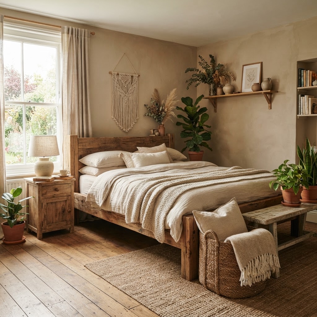
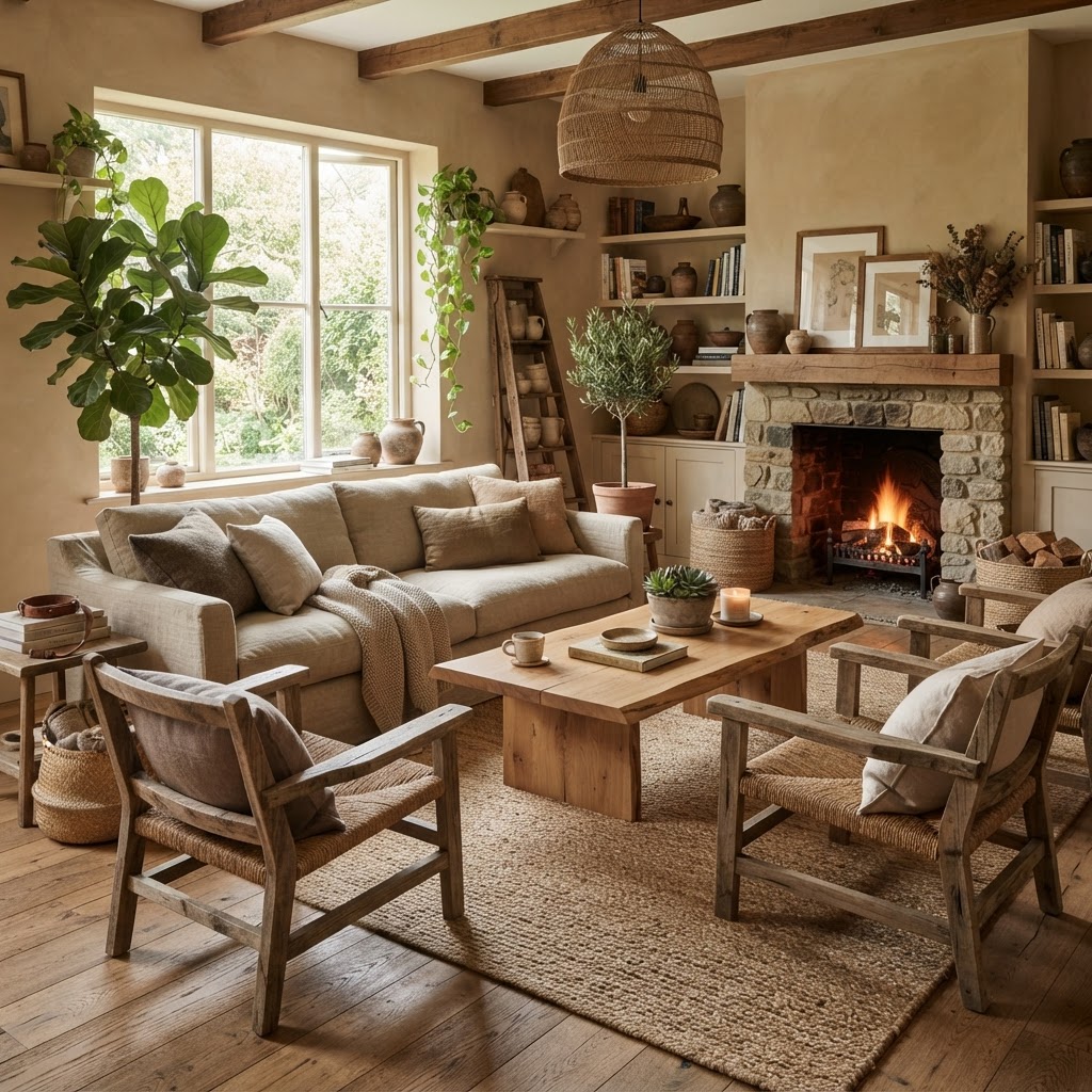
Warm organic rustic is the most requested design direction of 2024–2026 - a style defined by natural imperfection and material authenticity. Raw-edge wood furniture with visible grain and knots, linen and wool textiles in warm neutrals, ceramic vessels with hand-thrown irregularity, handwoven rugs in jute or wool, dried botanicals, terracotta pots. The palette is deep earth tones anchored by warm beige and terracotta, with green introduced through live plants rather than painted surfaces.
This style is distinct from farmhouse (which uses white shiplap and industrial metal) in its emphasis on organic form and natural material texture over structural reclaimed elements. It is also distinct from boho in its restraint - warm organic rustic is selective and grounded, where boho is accumulative and global.
The Two Most Common Warm Rustic Mistakes
Mistake 01
Confusing rustic with farmhouse
Farmhouse uses shiplap, galvanized metal, barn doors, and mason jars. Warm organic rustic uses raw-edge wood slabs, ceramic, linen, and dried botanicals. The farmhouse aesthetic is American vernacular; warm rustic is closer to a Mediterranean or North African sensibility of natural material warmth. Mixing the two produces a room that is neither.
Mistake 02
Too many brown tones without contrast
Warm rustic palette - terracotta, warm sand, raw wood, cream - can collapse into an undifferentiated brown if not anchored by contrast. The contrast can be dark (a deep charcoal throw, a black iron candleholder), cool (sage green plants, a muted blue-grey textile), or textural (smooth ceramic against coarse jute against soft linen). At least two contrasting elements are required to prevent the palette from reading as muddy.
Starting Budget Framework
Design your warm rustic room with Arova. It's the most-requested design direction on the platform - Arova knows the specific product sources and material combinations that make it work.
Start Warm Rustic Consultation →Style 06
Modern Minimalist
Precision as a form of luxury
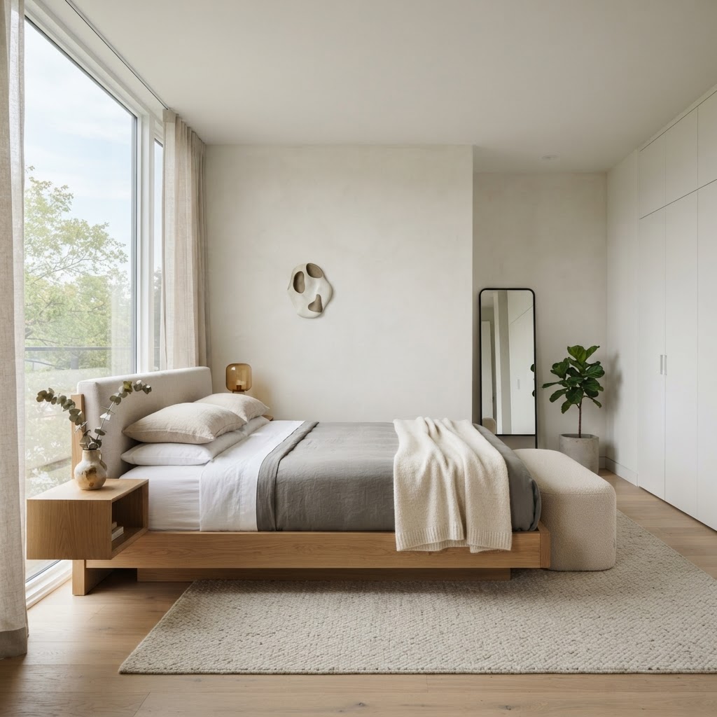
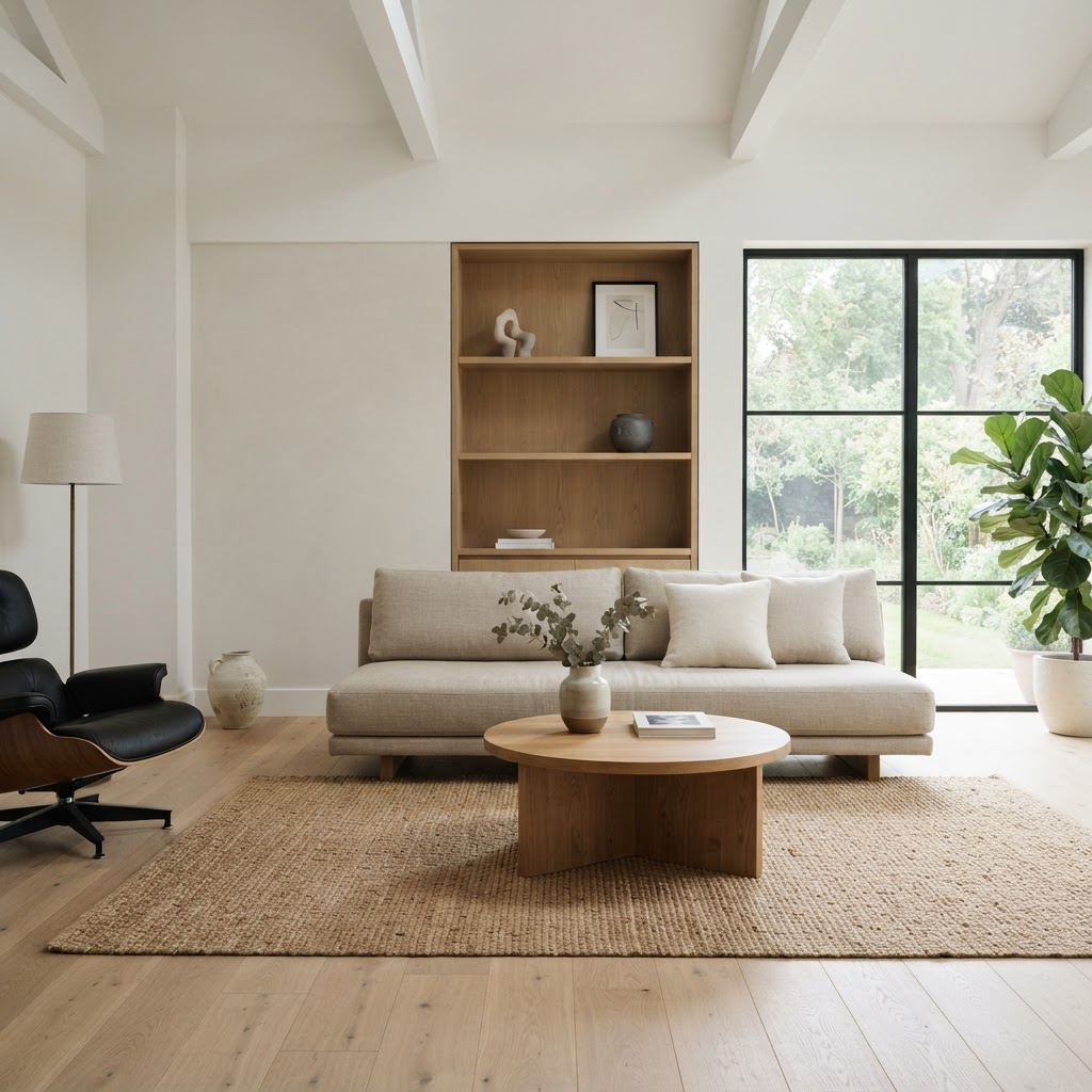
Modern minimalism is the most exacting design style to execute well and the easiest to execute badly. The premise - that reduction creates focus and each object receives more attention when fewer objects surround it - is genuinely philosophically rigorous. The practice requires discipline that most design projects don't sustain: every surface must be kept genuinely clear, every storage solution must be concealed, and every object that remains visible must be beautiful enough to justify the attention it receives.
The Two Most Common Minimalist Mistakes
Mistake 01
Mistaking "empty" for "minimal"
A room with nothing in it is not minimalist - it is unfurnished. Minimalism is a considered reduction to essentials, not an absence of objects. The essential pieces must be present, and each must be of sufficient quality to bear scrutiny without the distraction of surrounding objects. A minimalist room with a cheap sofa reads as under-furnished. A minimalist room with one excellent sofa reads as confident.
Mistake 02
No warmth anchors in the palette
Pure white and grey minimalism is the most difficult form to inhabit - it reads as stark rather than serene without warmth introduced through material texture, a warm-toned wood element, or a single natural fiber textile. Every successful minimalist room has at least one element that prevents the palette from reading as clinical: warm stone flooring, an oak shelf, a linen duvet in an off-white rather than pure white.
Starting Budget Framework
Design your minimalist room with Arova. Describe what you're starting with - Arova's first step for minimalist consultations is always the edit, not the shop.
Start Minimalist Consultation →Style 07
Industrial
The factory, made habitable
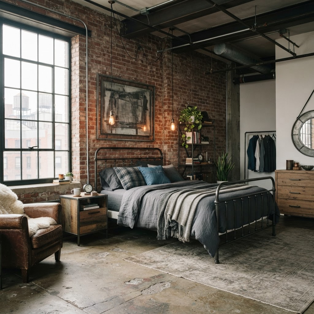
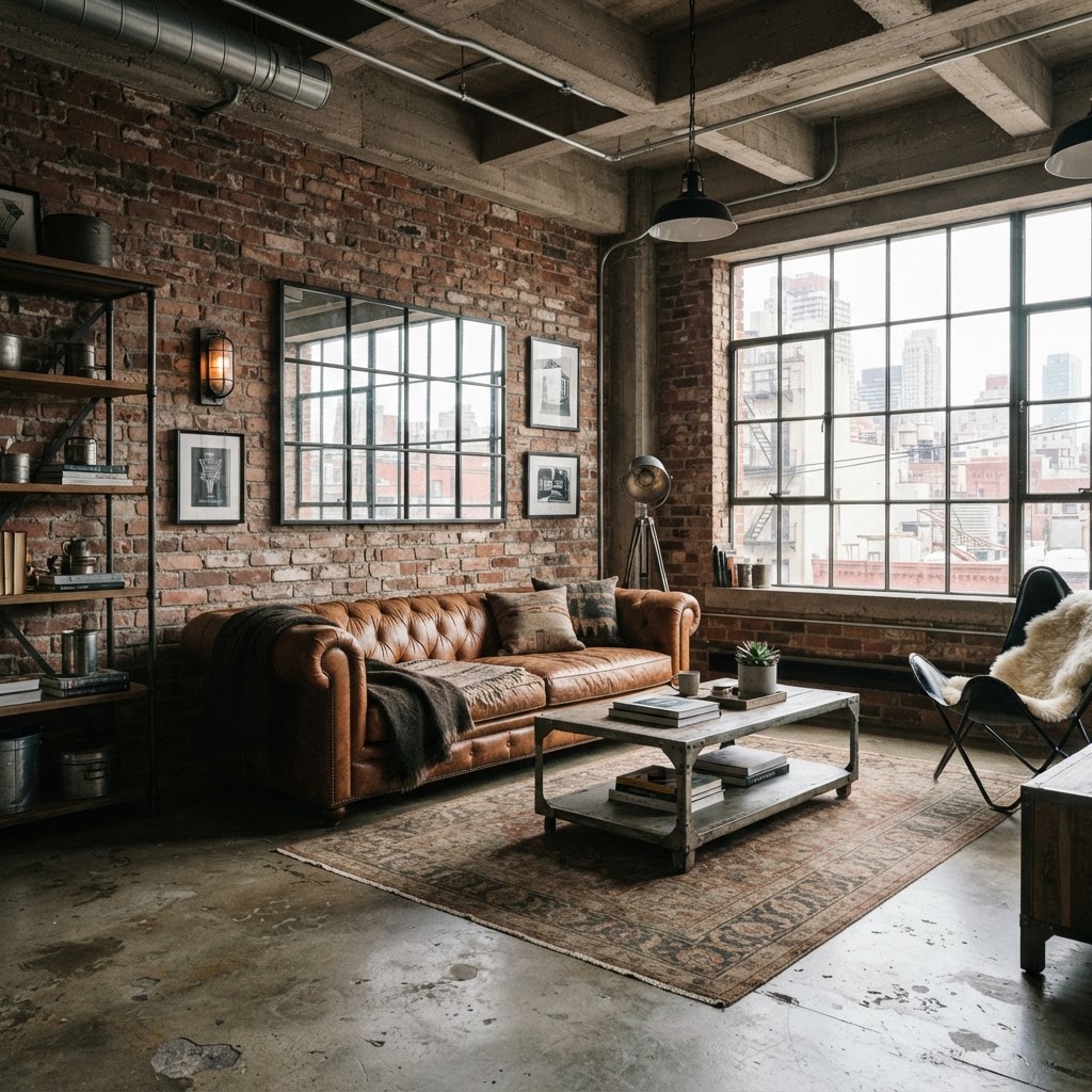
Industrial design takes its vocabulary from commercial and manufacturing spaces - exposed brick, raw concrete, black iron pipe, Edison bulbs, reclaimed wood - and makes them habitable through the introduction of warmth. The key word is "habitable": industrial design without warmth anchors produces a cold, institutional space. Industrial design with the right warmth anchors (leather, warm-toned wood, soft textiles in neutral tones) produces a space that is simultaneously raw and inviting.
The Two Most Common Industrial Mistakes
Mistake 01
All-metal, no warmth
Black iron, chrome, concrete, and cool-grey everything produces a room that feels like a parking garage rather than a home. Industrial design requires warmth counterweights: a leather sofa, a reclaimed wood dining table, a wool rug, warm Edison bulbs (2200K, not 4000K). The metal should be the structure; the warmth should be the habitable layer.
Mistake 02
Faux industrial elements with no context
Industrial design is credible when the raw elements are genuine - exposed brick that's actually brick, concrete that's actually poured or panel, wood that actually shows age and grain. Vinyl brick wallpaper, faux-concrete laminate, and "distressed" furniture that was manufactured to look distressed produces a theme-park version of industrial design that reads immediately as artificial.
Starting Budget Framework
Design your industrial room with Arova. Describe your existing architectural elements - exposed brick, concrete floors, pipe ceiling - and Arova builds the habitable layer on top of them.
Start Industrial Consultation →Style 08
Traditional
Permanence as a design value
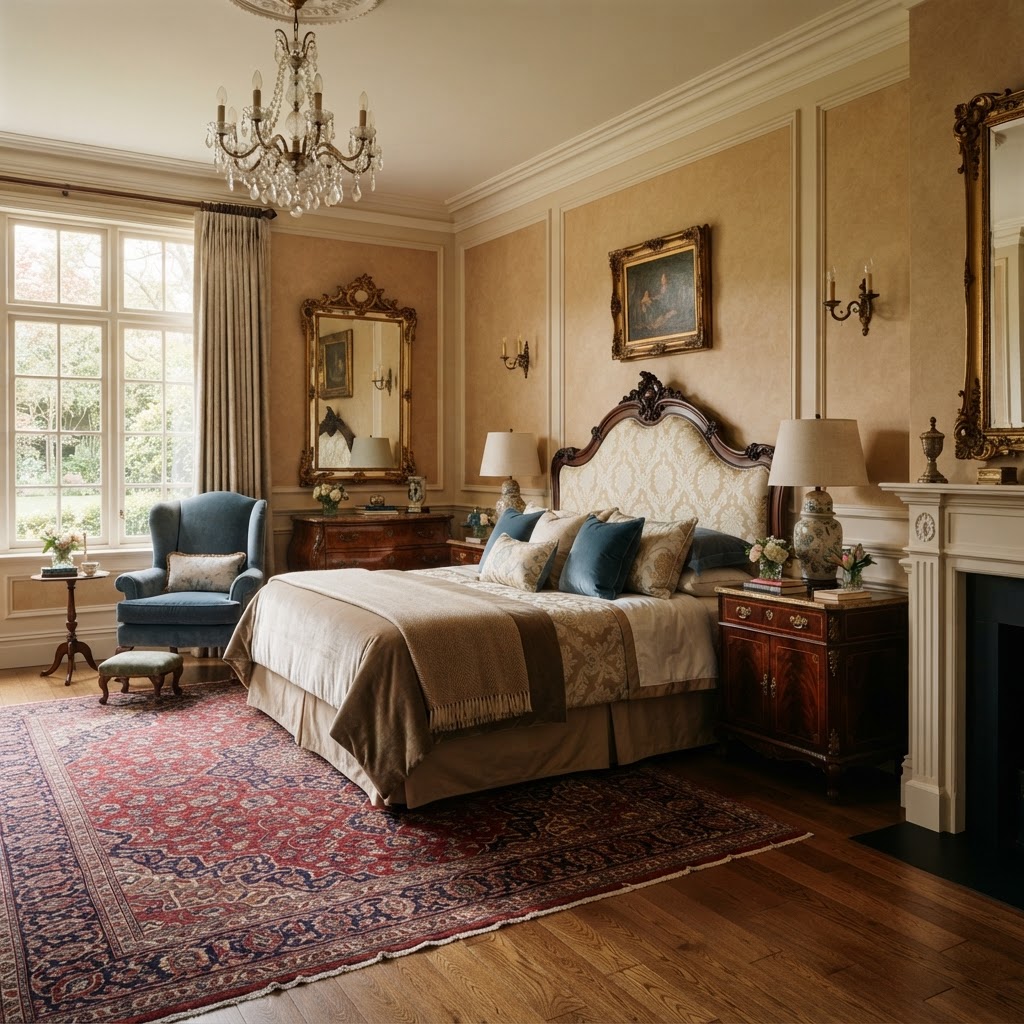
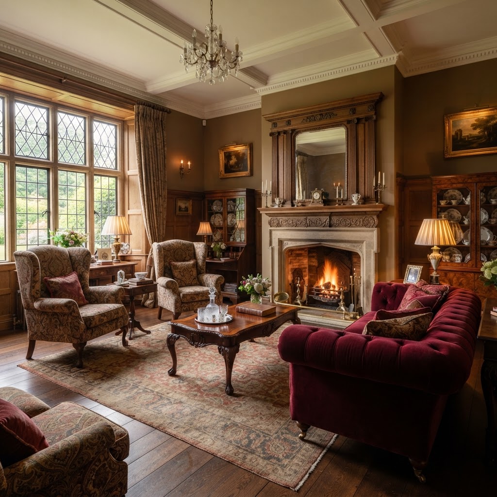
Traditional design is the design vocabulary of permanence - furniture built to last generations, materials that age rather than wear out, and an aesthetic that references historical design periods (Georgian, Federal, Victorian, Colonial Revival) without being slavishly period-correct. The defining characteristics: dark wood furniture (mahogany, cherry, walnut in darker stains), upholstered pieces in durable natural fabrics (wool, cotton, silk), symmetrical arrangements, and a layered, accumulated quality that suggests a room has been lived in and added to over time.
The Two Most Common Traditional Mistakes
Mistake 01
All period, no freshness
A room that reproduces a historical period exactly - all the elements correct, no concession to contemporary life - reads as a museum installation rather than a home. Traditional design updated for contemporary living requires at least one element of freshness: a contemporary art piece, a modern lamp shape, a current textile pattern that translates the traditional color palette into a non-period form.
Mistake 02
Ignoring scale relationships
Traditional furniture tends to be larger and more imposing than contemporary equivalents. A Chippendale sofa with curved camelback in a small apartment living room will dominate the space to the exclusion of everything else. Traditional design requires generous proportions - it works in rooms with high ceilings, substantial square footage, and the space to arrange furniture in formal conversation groupings with room to move around them.
Starting Budget Framework
Design your traditional room with Arova. Traditional and transitional style consultations are among the most nuanced on the platform - Arova helps you update the vocabulary for contemporary living.
Start Traditional Consultation →Style 09
Bohemian (Boho)
Collected, not decorated
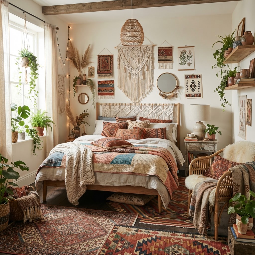
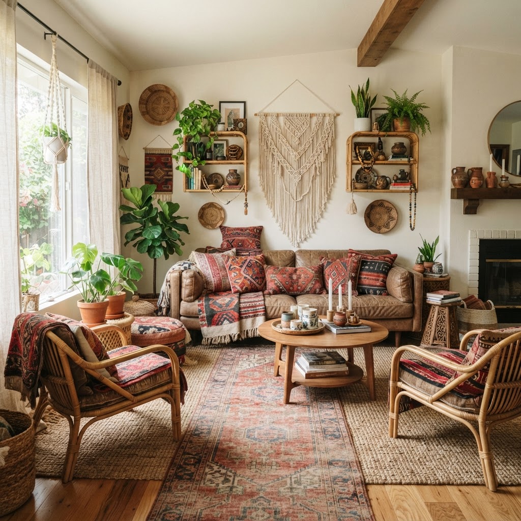
Boho design - derived from bohemian artistic traditions and expanded by global textile cultures - is the most personal of the major styles because it is fundamentally about accumulation of things that matter to you. Layered rugs, mixed textiles from different cultures, an abundance of plants, vintage and handmade objects, macramé and woven wall pieces, and a warm, eclectic palette that favors earth tones, muted jewel tones, and natural materials.
The defining principle of successful boho design is controlled eclecticism - the difference between a deliberately curated mix of global textiles and colors versus a room that just has a lot of things in it. Boho without curation crosses into clutter. Boho with curation creates richness.
The Two Most Common Boho Mistakes
Mistake 01
Accumulation without curation
Boho is frequently mistaken as permission to have everything. It is not - it is permission to have more things than minimalism allows, provided those things share a coherent visual language (natural materials, warm palette, handmade quality). A boho room with 15 different patterns in clashing colors, plastic accessories alongside natural fiber pieces, and objects with no relationship to each other is clutter with a Pinterest tag.
Mistake 02
Too many small rugs
Layered rugs are a boho signature, but the layering must have a logic: a large base rug (jute, sisal, or solid wool) with a smaller, more patterned rug layered on top and offset to the side. Multiple small rugs placed around a room without a large base rug fragments the space rather than creating richness. The base rug must be large enough to anchor the seating area before layering begins.
Starting Budget Framework
Design your boho room with Arova. Boho requires the most careful curation advice - Arova helps you identify the specific layering and palette logic that prevents boho from becoming clutter.
Start Boho Consultation →Style 10
Coastal
The light of water, made permanent
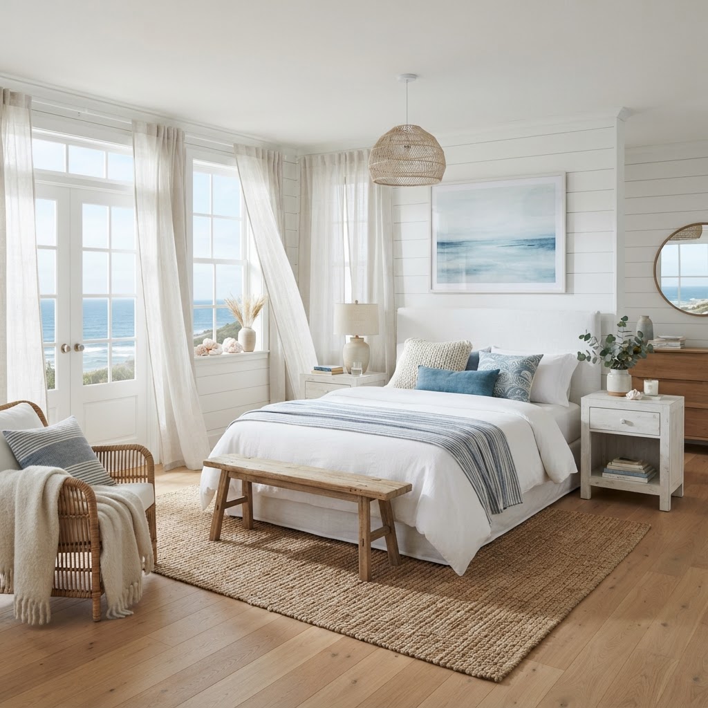
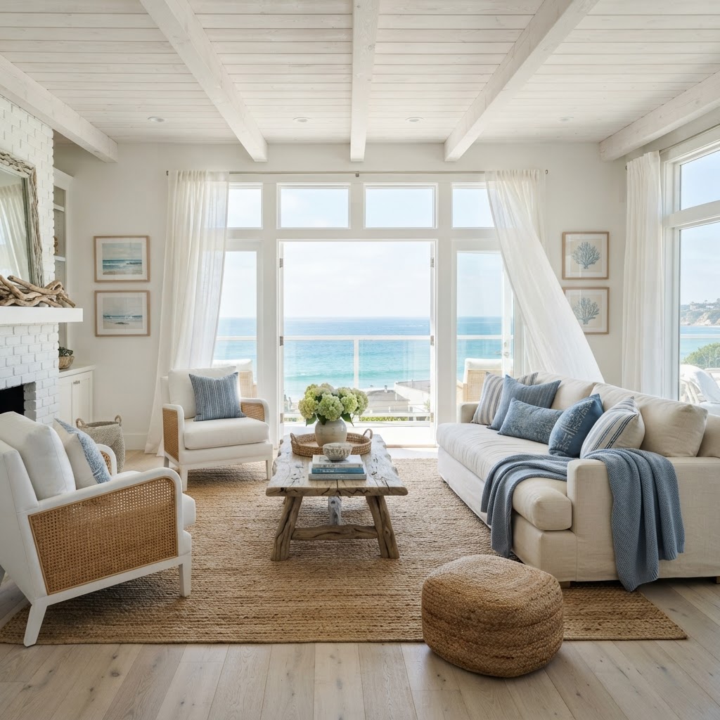
Coastal design - in its best contemporary form - is not the seashell-and-anchor nautical theme of the 1990s. Modern coastal design captures the quality of light near water: the bleached-wood warmth of driftwood, the soft blue-grey of sea glass, the airy lightness of rooms designed to maximize natural light and cross-ventilation. Materials are natural and textural: whitewashed or limed oak furniture, linen and cotton in sea salt white and sandy neutral, sisal and seagrass rugs, indoor plants with large, waxy leaves.
The Two Most Common Coastal Mistakes
Mistake 01
Literal nautical theming
Anchors, rope, life preservers, and sailor stripes are the coastal design clichés that turn a room into a theme park exhibit rather than a home. Contemporary coastal design references the quality and feel of coastal environments - the light, the material texture, the color palette - without literal maritime imagery. If an object could be sold in a souvenir shop on a boardwalk, it does not belong in a coastal room designed for habitation.
Mistake 02
Too saturated a blue palette
Coastal blue should read as the soft, faded blue of sea glass or bleached-out skies - not the vivid royal blue of a nautical flag. Saturated bright blue in a coastal room reads as beachwear rather than coastal design. The blues that work: Benjamin Moore's Coastal Fog, Farrow & Ball's Borrowed Light, Sherwin-Williams' Oyster Bay - all are muted, slightly greyed blues that look like water rather than paint.
Starting Budget Framework
Design your coastal room with Arova. Arova helps you find the right coastal palette for your specific light conditions - because coastal design that works in a south-facing room looks different from the same style in a north-facing one.
Start Coastal Consultation →Which Design Style Are You?
4 questions. 30 seconds. A starting point for your room.
Question 1 of 4
Which color palette feels most like home to you?
Frequently Asked Questions
Style Questions Answered
Start by editing - remove every object that is either purely decorative without craft quality or doesn't serve a function. What remains is the foundation. Then: ensure all wood tones are light (ash, light oak, bamboo, white oak); replace any synthetic textile with natural fiber (linen duvet, wool rug, cotton curtains in undyed tones); add one live plant in a ceramic pot; and eliminate visual clutter by giving every object a home. The shopping comes last, and the purchases are fewer and more intentional than most other styles.
Arova Design · AI-Powered Interior Design
Know your style. Now design the room that lives in it.
Describe your space. Get a specific, sequenced action plan - products, priorities, and design reasoning - built around the style you respond to.